What changed in ChatGPT Images 2.5 compared to 2.0?

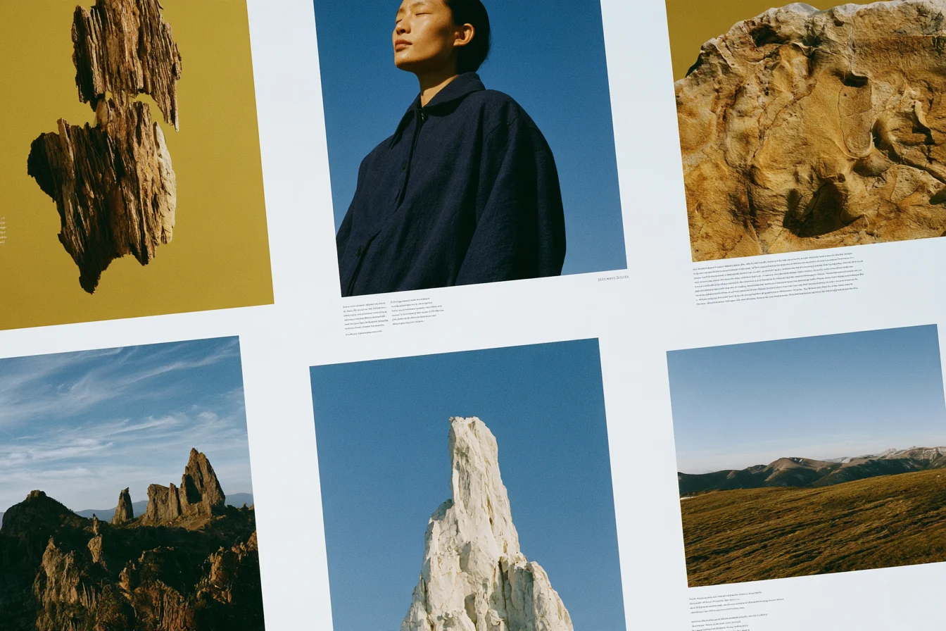
What changed in ChatGPT Images 2.5 compared to 2.0? We ran the same prompts in both versions and found three differences: more consistent results across runs, sharper surface detail, and cleaner flat backgrounds.
OpenAI's release notes focus on faster generation and more consistent multi-turn editing. We wanted to see how those changes show up in real images, so we compared portraits and product shots, running each prompt four times in each version.
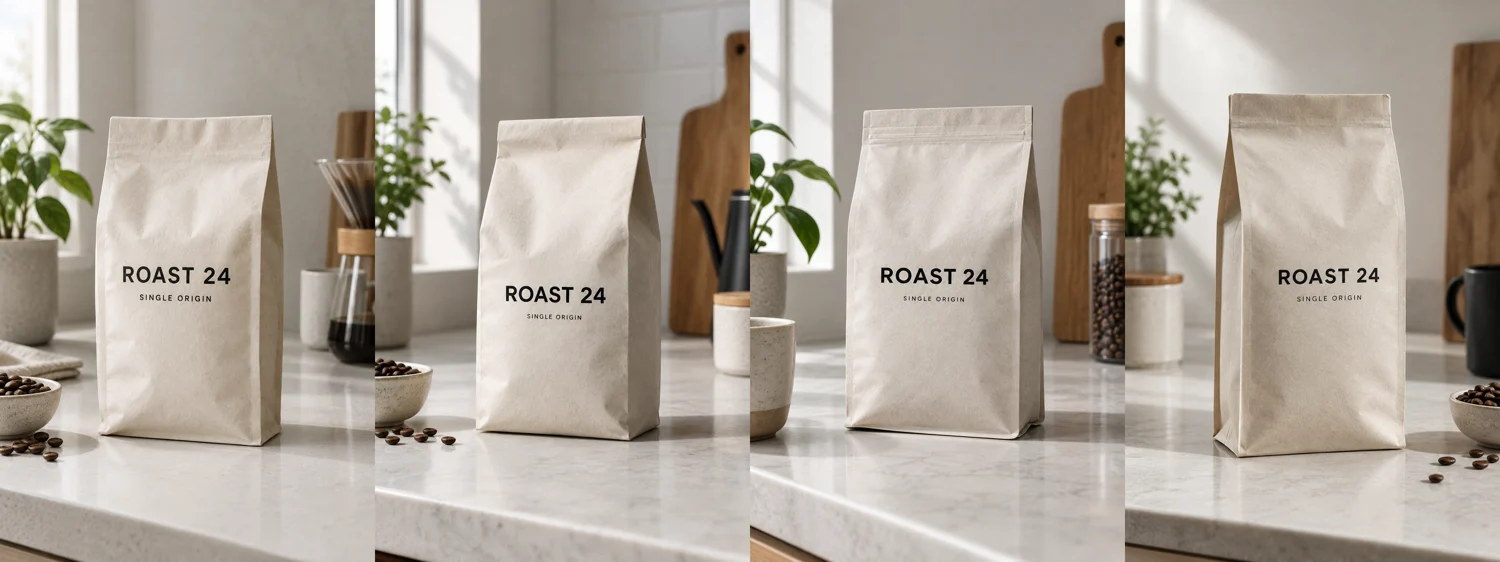
Greater visual consistency across repeated generations
The first difference we noticed was how much results varied between runs.
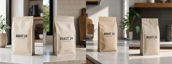
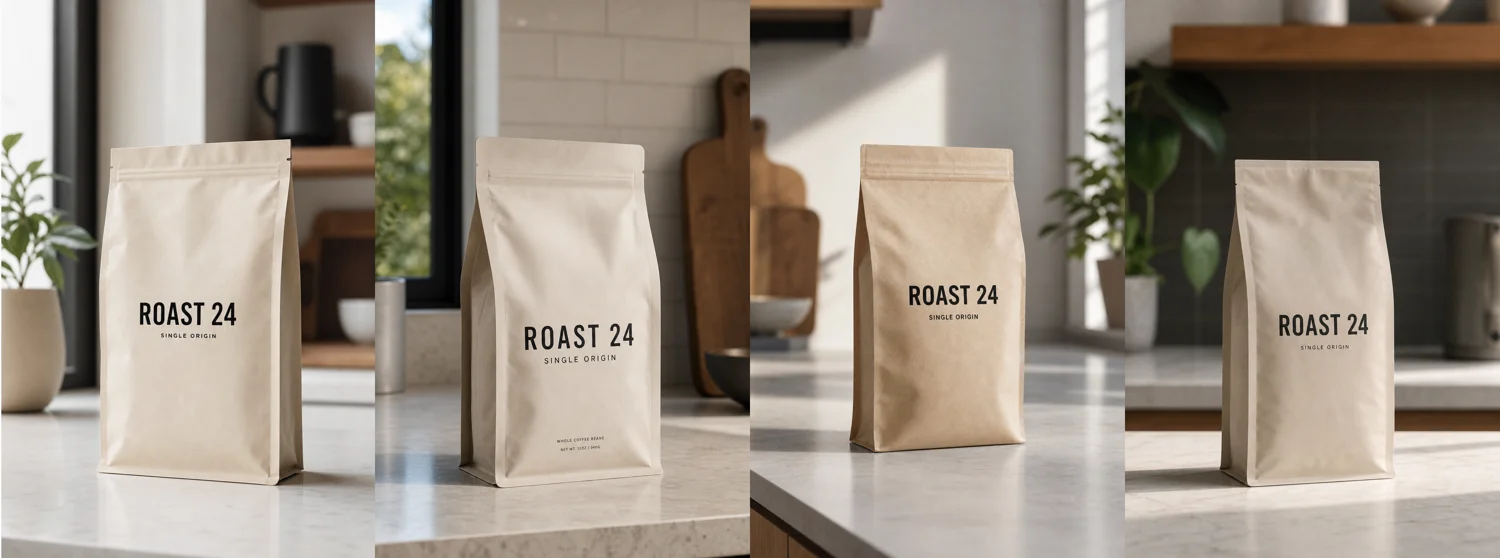
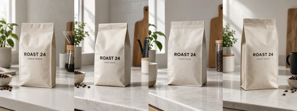
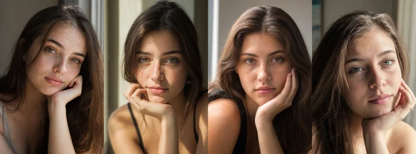
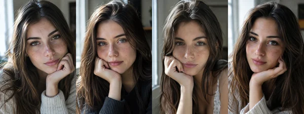
In version 2.0, our four runs of the same prompt produced noticeably different camera angles, background colors, and prop arrangements. When prompt strings were open-ended, the model filled in details with high variance.
In version 2.5, repeated runs with the same prompt converge closely on a unified composition and color palette. Camera perspectives and lighting directions remain stable across iterations. If you need a consistent series or brand assets, that predictability helps.
Richer surface detail versus over-embellished rendering
Version 2.5 introduces higher detail density across lighting, textures, and specular reflections. Depending on the visual goal, this can either improve an asset or make it look overly stylized.
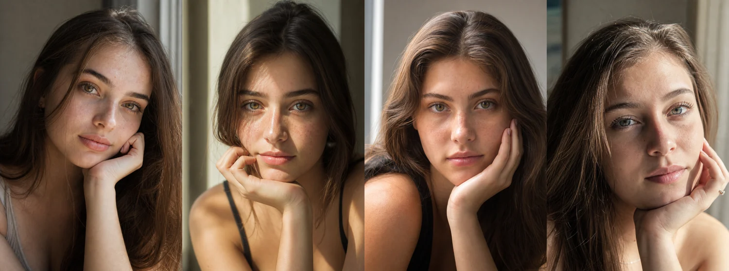
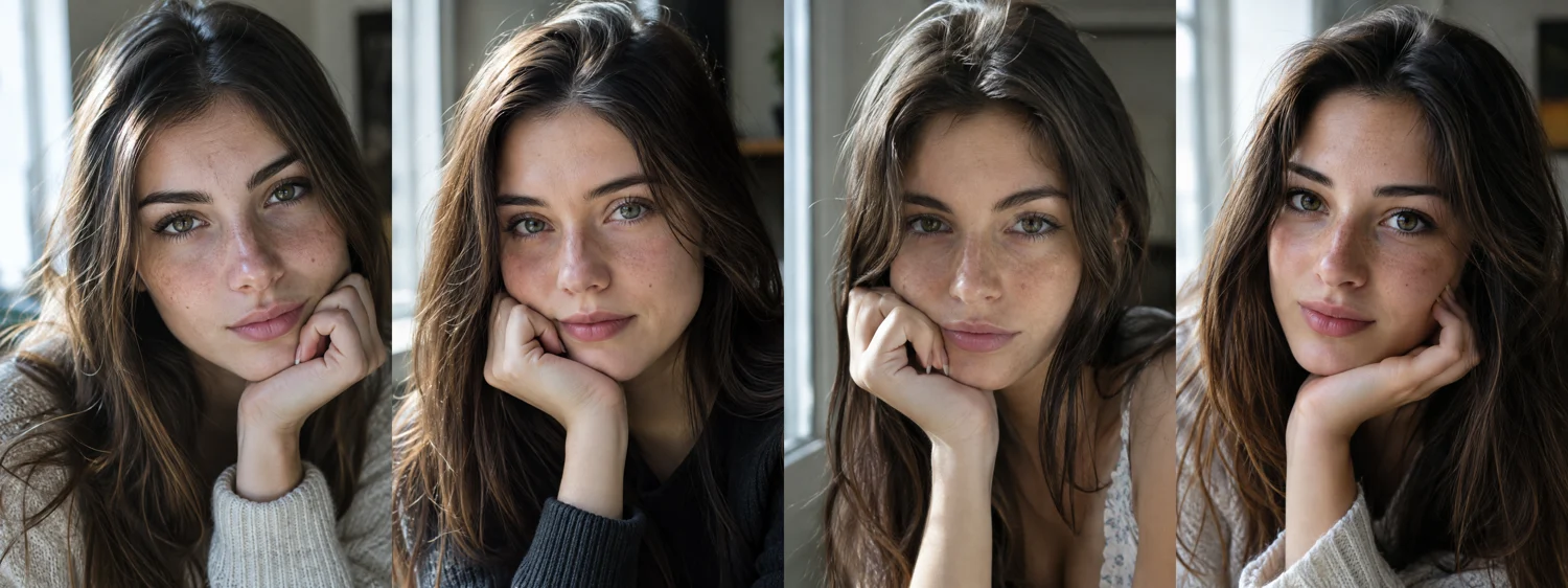
Portraiture: More pronounced micro-textures
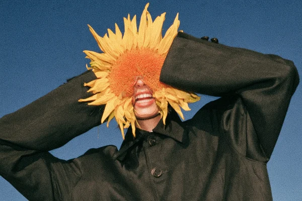
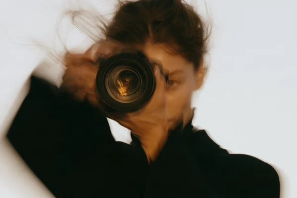
In a portrait test featuring a subject in natural sunlight, version 2.5 rendered facial texture much more sharply. Skin pores, fine freckles, individual hair strands, and fingernail contours are defined with greater precision than in 2.0. While this eliminates artificial skin smoothing, the micro-textures can occasionally look emphasized if lighting is not carefully controlled.
Product visualization: High-contrast drama versus understated realism
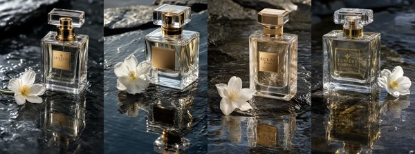
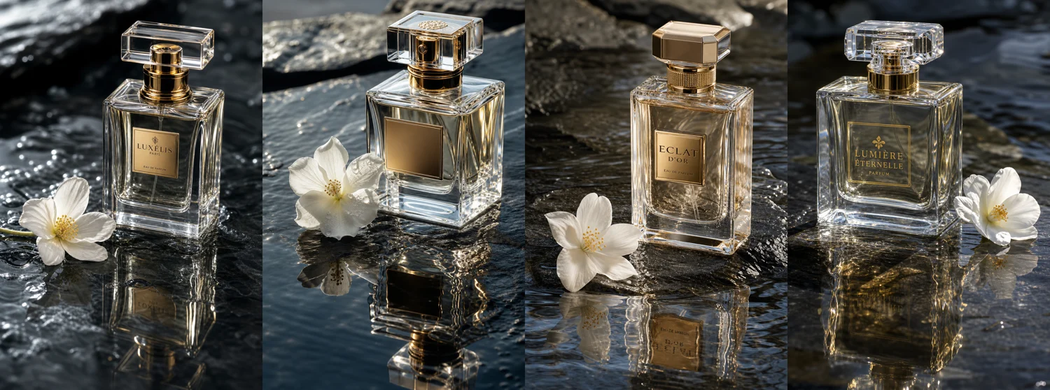
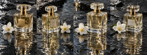
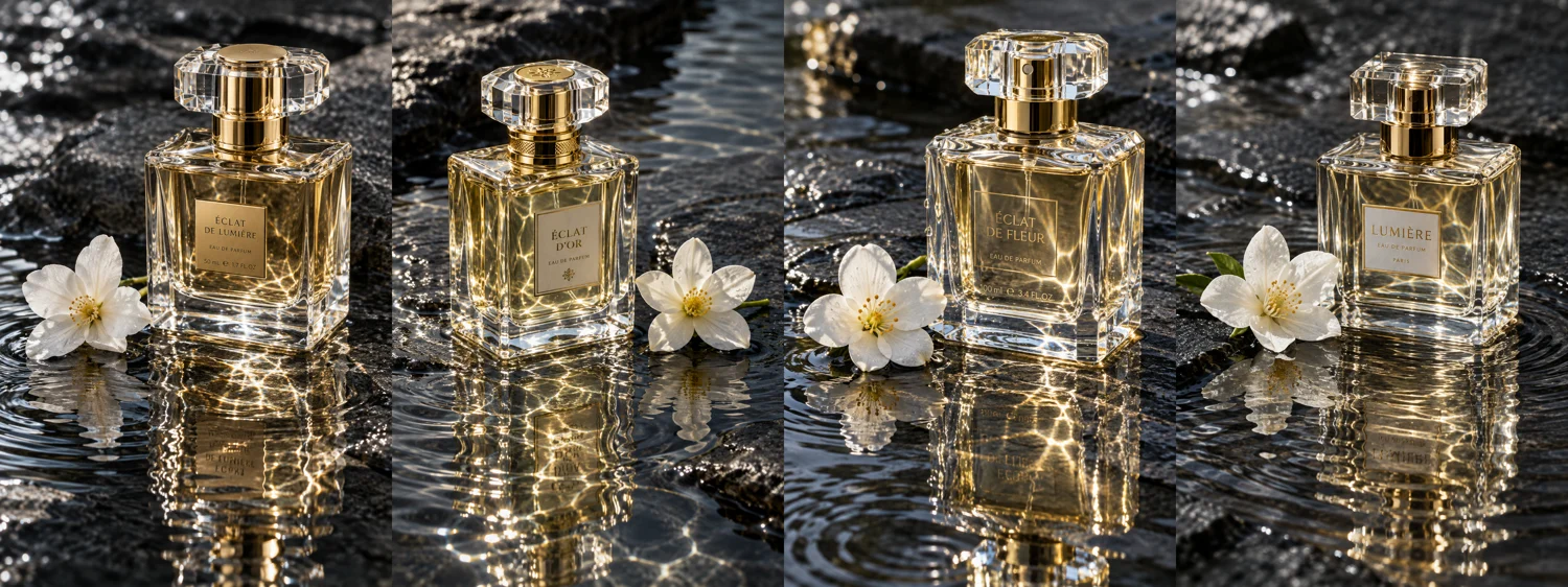
The trade-off becomes clearer in commercial packshots. Testing a luxury glass perfume bottle on wet dark slate showed that version 2.5 pushed specular highlights, complex glass caustics, and vivid water reflections to their maximum.
The 2.5 output looks like a commercial campaign shot, while 2.0 felt more grounded. The softer illumination in 2.0 gave the glass a quiet, editorial weight that designers may prefer over the high-contrast brilliance of 2.5.
Reduced background artifacts on flat surfaces
A persistent issue in version 2.0 was subtle pixel grain and patchy noise across solid backdrops and smooth planes.
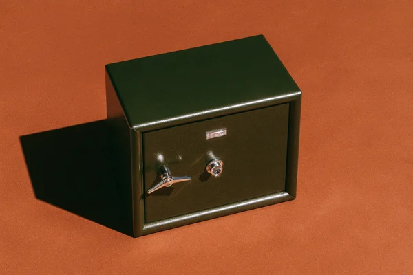
Version 2.5 resolves much of this surface noise. Seamless studio backdrops, concrete planes, and solid matte packaging materials render with cleaner, more uniform gradients. This makes it easier to cut out subjects or place generated assets directly into graphic layouts without extensive post-processing cleanup.
Adjusting your prompts for 2.5
In short:
What improved: In our runs, framing stayed consistent across repeated generations and flat surfaces showed less noise. OpenAI also reports faster generation.
Prompting adjustments: Because the base engine naturally renders higher visual contrast and denser textures, prompts aimed at minimal, quiet, or documentary aesthetics should avoid redundant descriptive superlatives. Explicitly specifying soft, flat, or diffused lighting prevents the model from over-embellishing subtle scenes.
These observations come from four runs per prompt in each version, and results may change as OpenAI updates the model. For the two 2.5 variants in the API, see Is there a real quality difference between ChatGPT Images 2.5 Flare and Sunburst?